5 Data Visualization Best Practices for Clearer Dashboards
Transform your raw data into compelling narratives that drive executive decisions and operational clarity.

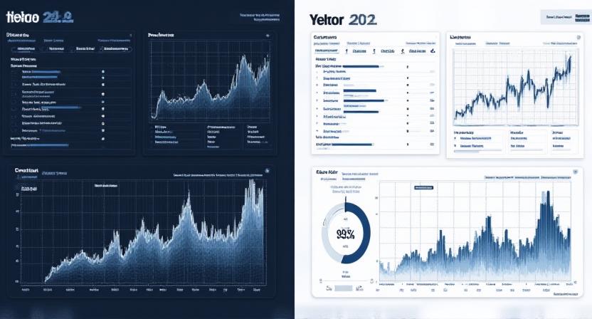
At Indigo Insights, we believe that data without a story is just noise. High-impact organizations don't just dump charts onto a screen; they craft visual experiences that guide the user to a definitive conclusion. To help you bridge the gap between complex datasets and actionable wisdom, we've compiled our top five principles for dashboard design.
Match the Chart to the Message
The most common mistake in visualization is using the wrong tool for the job. To ensure your audience understands the data instantly, remember these simple rules:
- Bar Charts: Ideal for comparing categories.
- Line Charts: Best for showing trends over time.
- Pie / Donut Charts: Use sparingly, only for simple parts-of-a-whole (max 3-4 segments).
Eliminate "Chart Junk"
Edward Tufte coined the term "chart junk" to describe unnecessary visual elements that distract from data. Avoid heavy grid lines, 3D effects, and excessive beveling. If a visual element doesn't help represent a data point, remove it. Simplicity is the ultimate sophistication in analytics.
Strategic Use of Color
Color should be used to draw attention to critical insights, not just to make the dashboard look pretty. Use a neutral palette for standard data and reserve high-contrast or vibrant colors (like our Indigo or Amber) for breakthroughs, outliers, or warning flags.
Pro Tip: Ensure your color choices are accessible to color-blind users by testing palettes with simulation tools.
Provide Historical Context
A number in isolation means nothing. Is £50k in monthly revenue good? It depends—was last month £10k or £100k? Always include:
- Year-over-year (YoY) comparisons.
- Baselines or target benchmarks.
- Historical rolling averages.
Know Your Audience
A CFO needs a different dashboard than an Operations Manager. Before designing, ask: What problem are they trying to solve in the next 5 minutes? Design with their technical proficiency and specific KPIs in mind.
The Indigo Insights Advantage
Better visuals lead to faster, more confident executive decisions. When data is clear, the path forward becomes obvious. Indigo Insights helps London's leading firms turn complex spreadsheets into intuitive visual stories.
Elevate Your Analytics